BNM GROUPUniting a fragmented brand
BNM is an innovative pharmaceutical company delivering products across Australia, New Zealand and the South Pacific Islands. Since 1957 the family owned and operated company has been committed to helping patients lead healthier lives.
SCOPE— Strategy
— Marque
— Identity
— Guidelines
— Packaging
RECOGNITIONGraphis Design (US)
— Merit
Challenge
—
BNM asked us to help define their brand strategy, refine their identity and align their product packaging by creating a design system for use across their Hospital & Ethical product range.


Typographic Solution
—
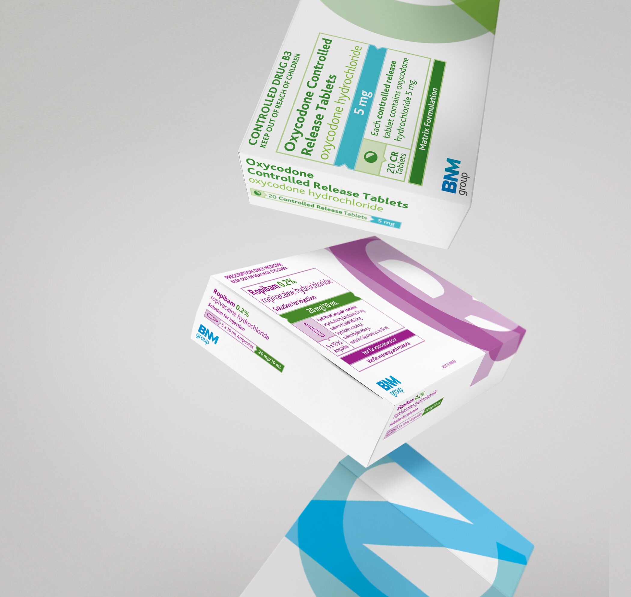
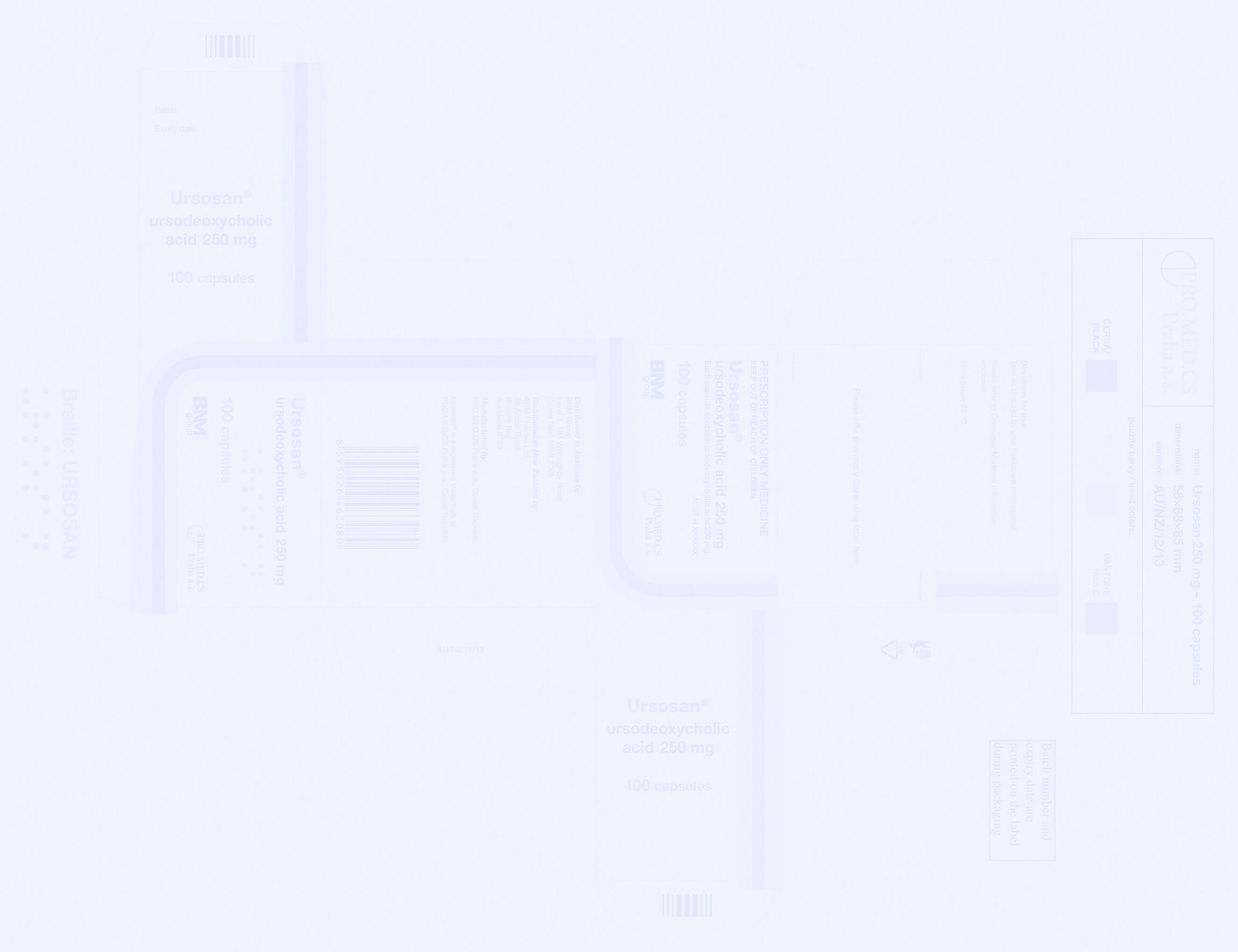
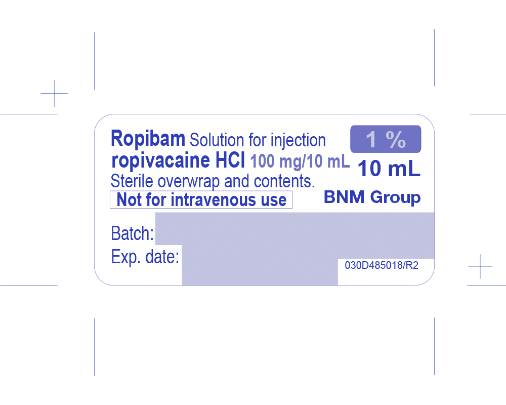
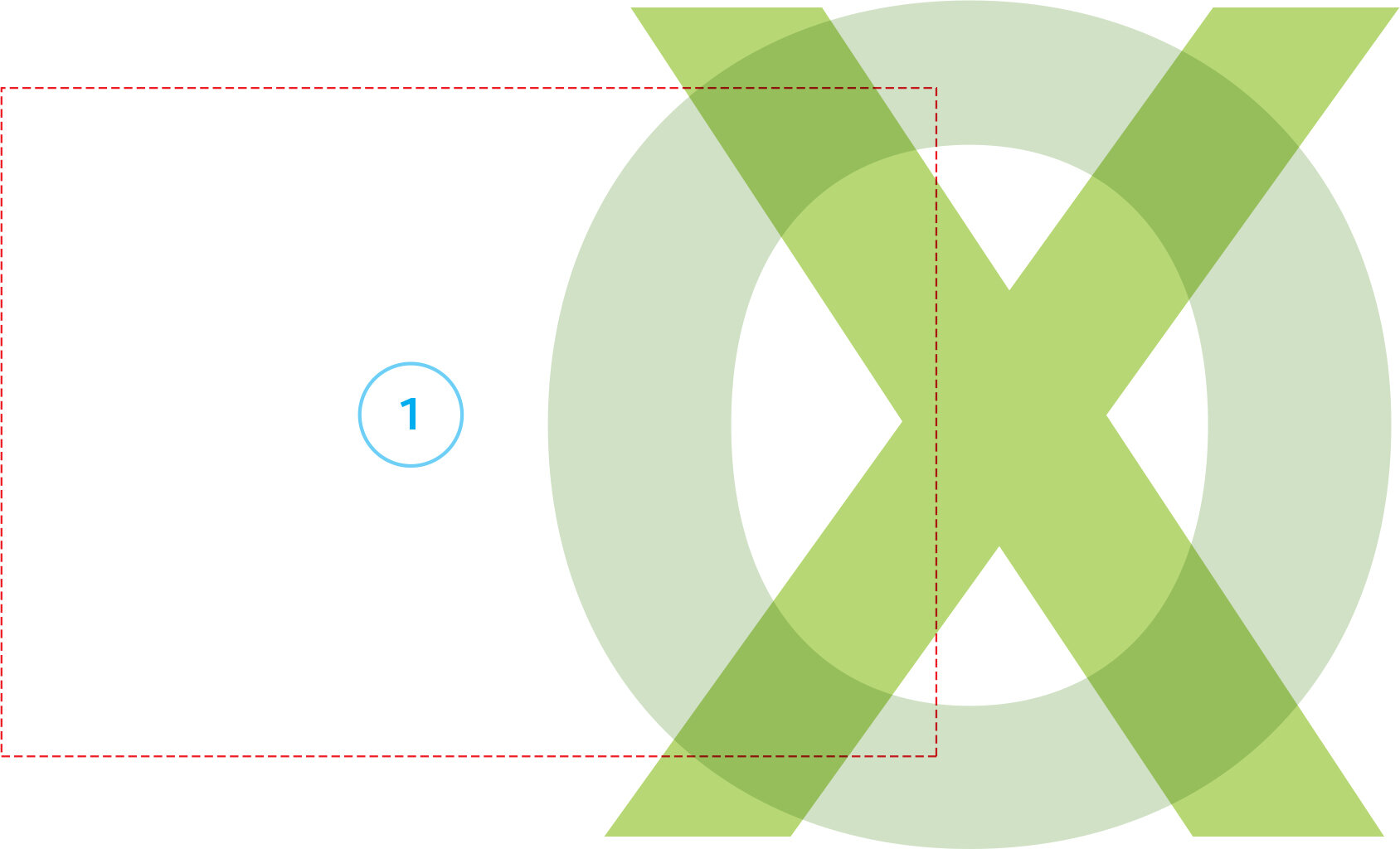
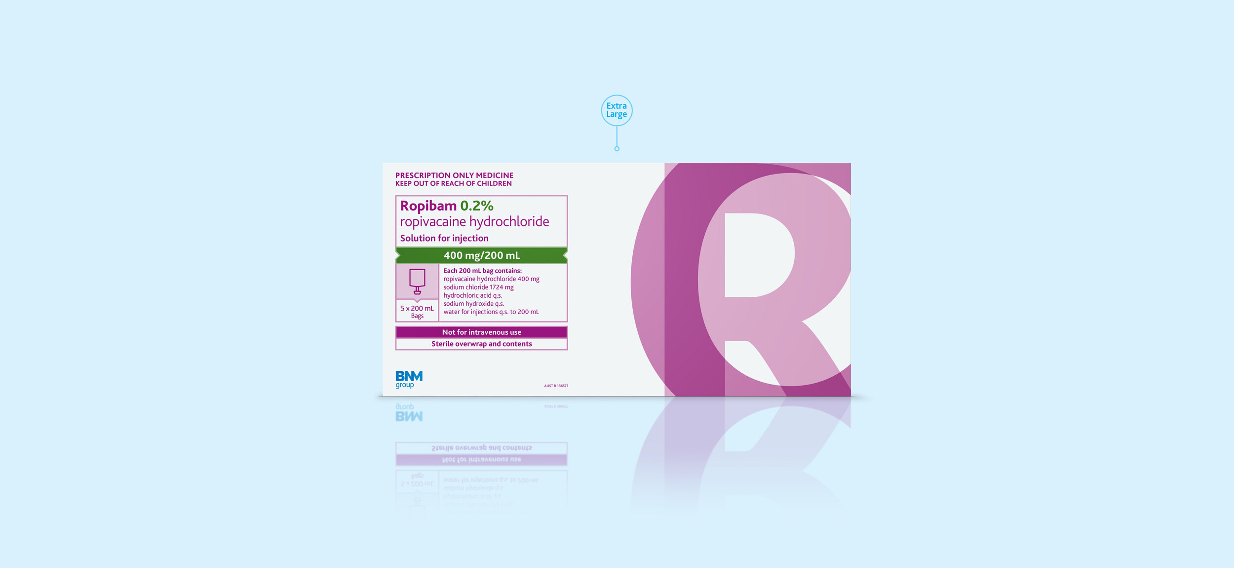
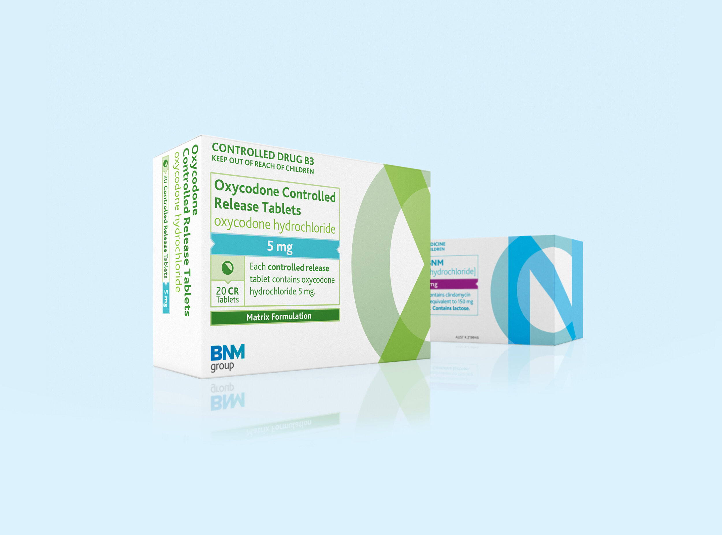
In creating the brand packaging, we designed a bold and recognisable coding system for the products by combining large typographic graphics (eg. Ropibam = RO, Oxycodone = OX, Clyndamicin = CN) along with a simple, modular information panel and suite of icons.
This provided the right balance between a recognisable BNM brand packaging and a practical, informative pack design.

Typographic System
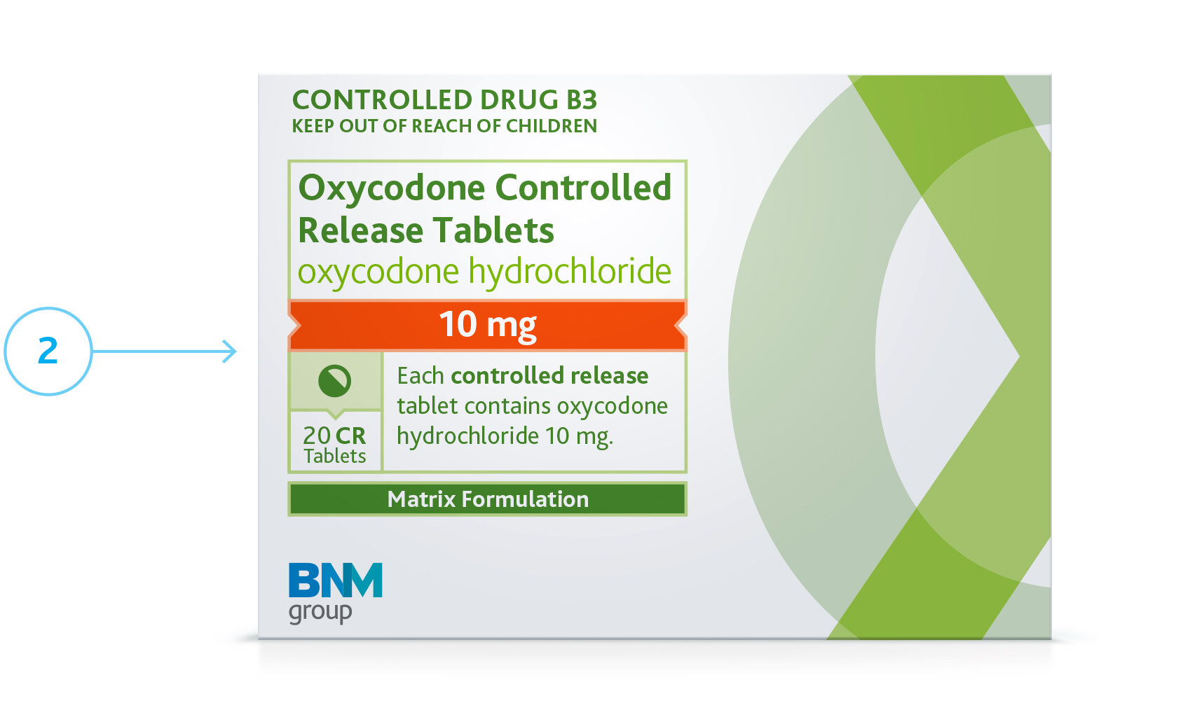
Information Panel
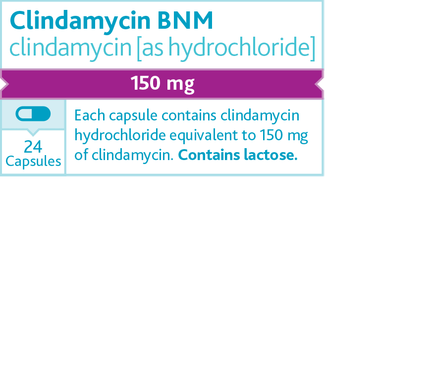
Icon Suite
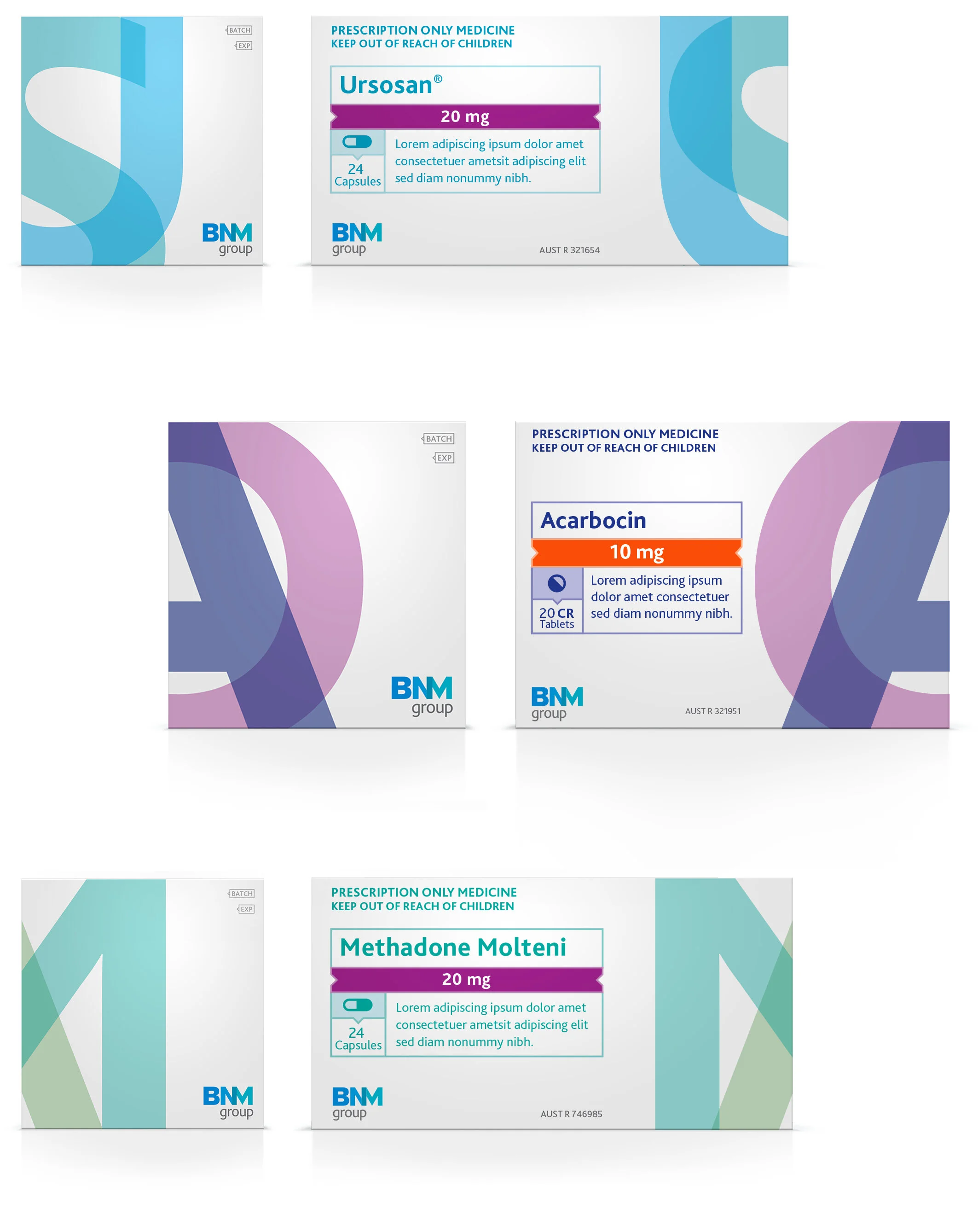


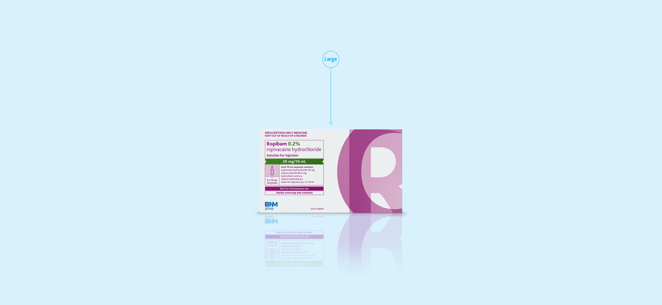


Flexibility
—
The brand packaging system was applied to a range of products across various substrates and production methods.


The work resulted in a brand packaging range and supporting material that re-established BNM Group as a serious player in the pharmaceutical market.
A united brand identity that brings all of the BNM Group H&E products under one banner.
FBD TEAMCreative Direction
— Chris Thomas
Strategy & Naming
— Louise Broad
Senior Design
— Anthony Smith