
CELSIUS — REBEL SPORT
— CASE STUDY
— 8 MIN READ
Supporting Australians on their unique fitness journey
A brand refresh and new packaging and design system to elevate the status of Celsius brand in-line with the revamped Rebel Sport retail experience.
NOTE: FLASH PHOTOGRAPHY USED ACROSS SOME VIDEOSCOPE— Brand Strategy
— Tone of Voice
— Identity System
— Packaging System
— Brand Guidelines
— Art Direction
— Photography
— Iconography
— Illustration
— Point of Sale
— Supporting Print Assets
— Digital Assets

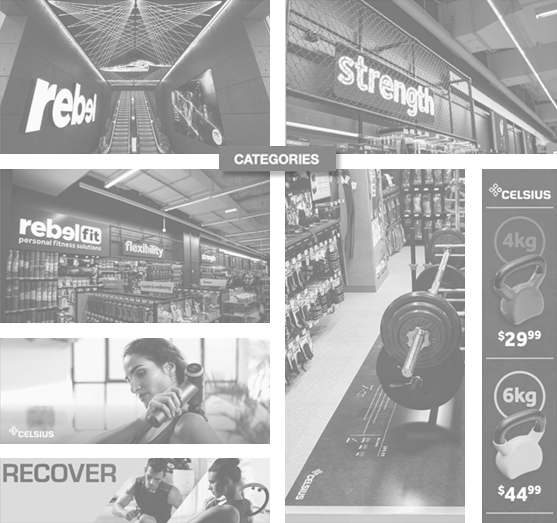
Rebel Sport updated retail experience
Founded in 1985, Rebel Sport has become Australia’s largest sporting retailer, and since its inception in 2006, Celsius has grown with it — delivering accessible and trusted fitness equipment to 3 million Rebel Active members and a broad range of customers.
In 2023 Celsius turned 18 years young, and in conjunction with a revamped and extensive retail experience undertook a body of work to update and re-align their brand strategy and brand identity system.
The brand refresh focused on their current packaging design (shown here) and had a clear objective to support Celsius as they purposefully extend and developed their range to suit both new and existing customers.

Celsius packaging design (before refresh)

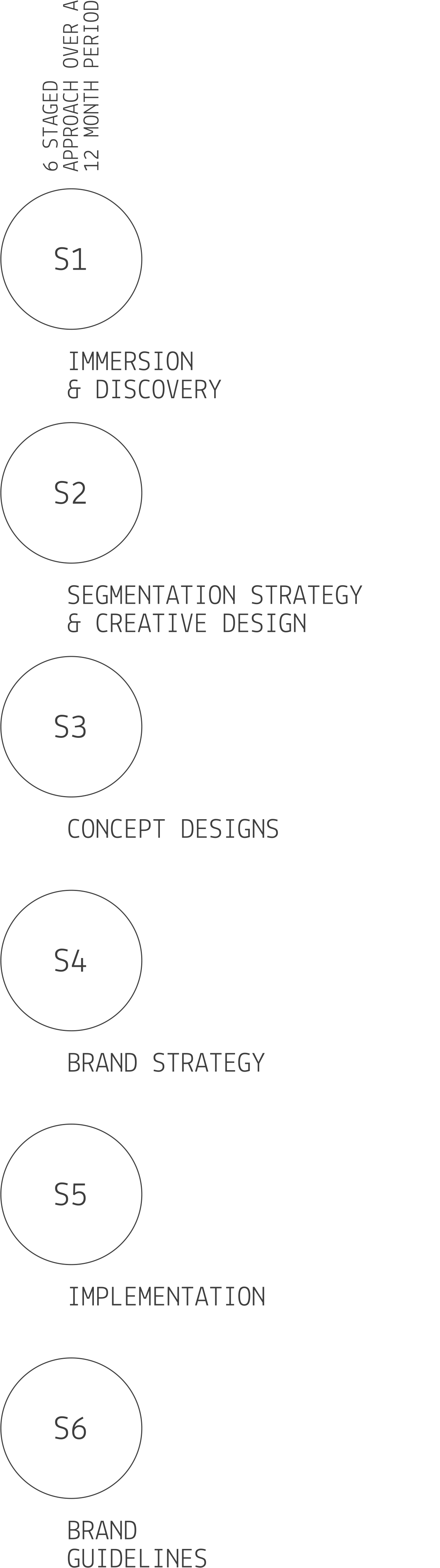

Process
—
The bespoke six staged program of work was created to re-define and clarify the brand strategy as well as asses and re-design the current segmentation, design and packaging system. The work was implemented in partnership with industrial designers BlueSky Design.
[S1] Our immersion and discovery phase included store visits, conversations with staff and key stakeholder interviews. This provided the context for developing a clear product segmentation and brand positioning strategy [S2] , which would later lead to the revised brand strategy.
[S3] Our key stakeholder interviews and discovery work identified key areas or opportunity to elevate the brands position. Through a series of conceptual design we explored how a revised system could create a purchase experience for the customer that was far more intuitive, informed and engaging.
[S4] Our immersion and conceptual work was used to inform and shape a revised brand strategy and tone of voice / writing style. This reinforced the concept development work and outlined the criteria which was used to select the final direction.
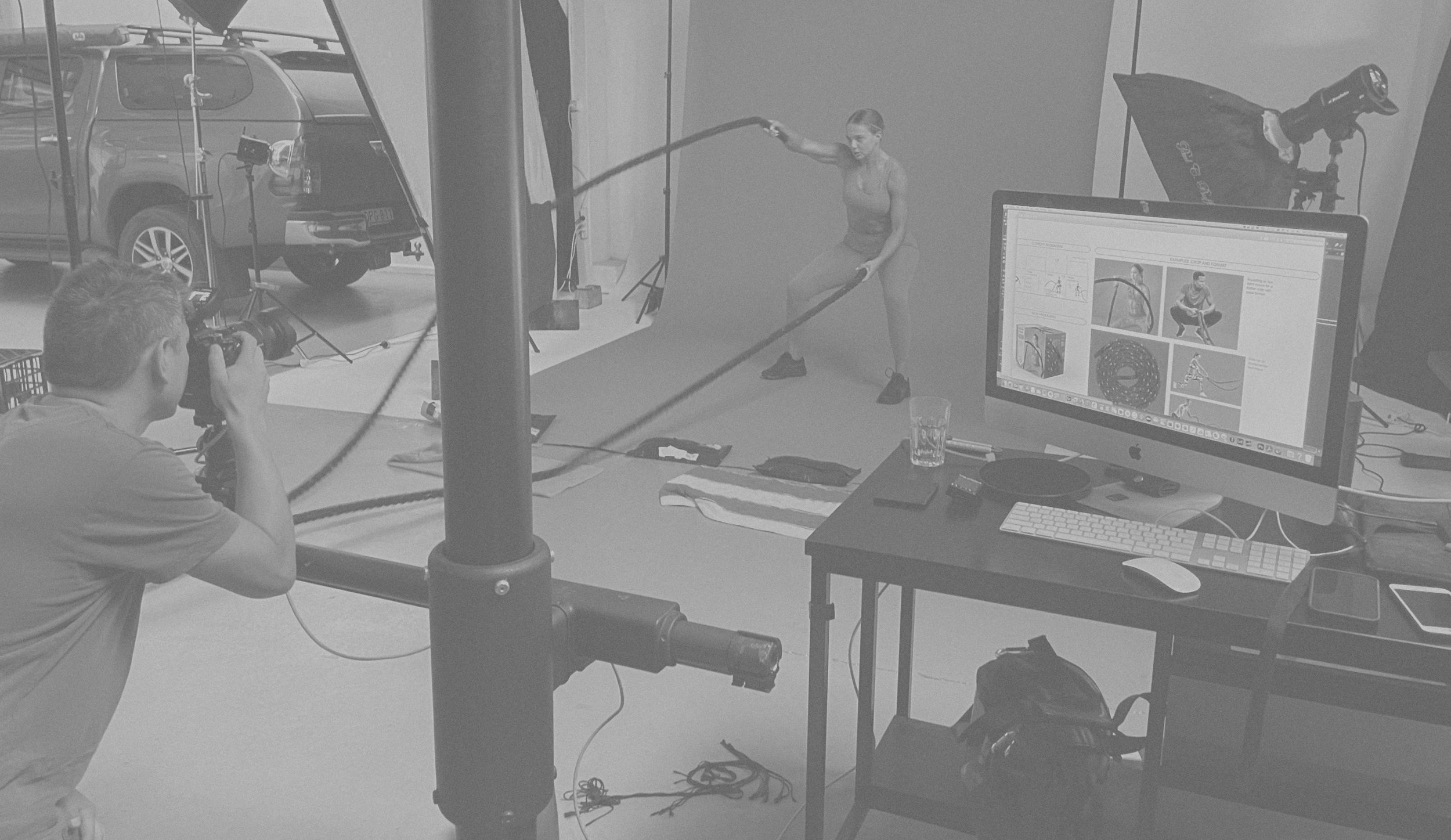
[S5] After several key stakeholder interviews the refined concept work was implemented across packaging and other applications. This included artworking print files, liaising with Celsius’ production team in China and overseeing and art directing a set photography shoots.

[S6] The final stage of work was to collate the material in a comprehensive 160 page Brand Guideline. This included the Brand Framework, tone of voice, photography, packaging design, product branding, user manuals, point of sale and digital applications.
Brand Positioning
—
Supporting all Australians on their unique fitness journey.
—
As a brand extension of Rebel, Celsius becomes the ‘enabler brand’, fulfilling the conceptual Rebel vision in a tangible and physical way.
Providing people with the means to get fit, stay fit and discover their own paths to health and wellness.
Making the user the centre of attention creates a meaningful and enduring relationship between brand and customer. With energy, understanding and rapport, Celsius becomes their partner in a real-world way.

Creative Strategy
—
In a sector dominated by black we had a decision to make — to fit in or stand out.
Celsius products span several categories including home gym equipment, fitness, recovery and yoga. Categories that, with the exception of yoga, use predominantly black as their dominant colour.
With this in mind, combined with the refreshed Rebel stores adopting a monochromatic palette the decision was unanimous — Celsius would be designed to stand out.
Segmentation
—
Colour was used to help differentiate the five product categories: accessories, fitness, recovery, home gym and yoga.
Segmenting with colour helps customers and staff to identify a product category. It also created a visually rich wall of products in store, boldly standing out against in a sea of black.
All packaging and supporting material follow the same colour system creating a unified system in-store and online.


Design System
—
Working with an existing brand the brief was to evolve the current design. We started with the logo and created a system that would influence every visual aspect of the brand from icons to packaging structure.


The Ribbon
—
The Ribbon device was created as a graphic system for use across all collateral.
By using shapes derived from the Celsius Symbol to build the Ribbon and a supporting suite of graphics we create a strong visual link across all design elements.
As a core element of the packaging design the Ribbon contains key information and runs across the front, top and down the back of packs.

A vertical and horizontal Ribbon was created for use.


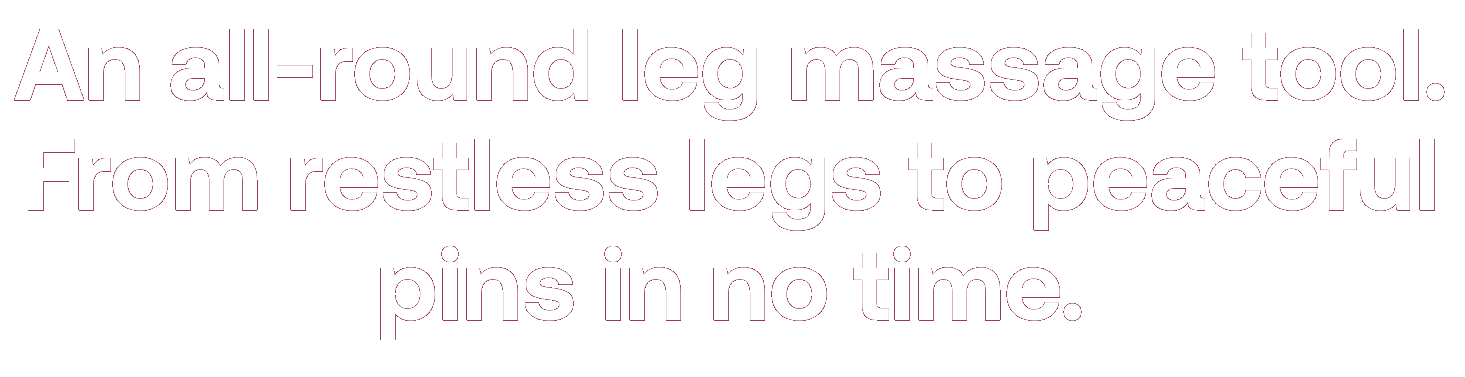
Tone of voice
—
In collaboration with Orange Smart we developed and documented Celsius’s tone of voice.
Using a language that talks directly to the customer through words they use themselves, they can start to build a relationship with the brand.
With energy, understanding and rapport, Celsius becomes the customer partner in a real-world way.

Iconography
—
We provided the tools and messaging that enables Multigate to clearly communicate in a meaningful and engaging way to their customers.

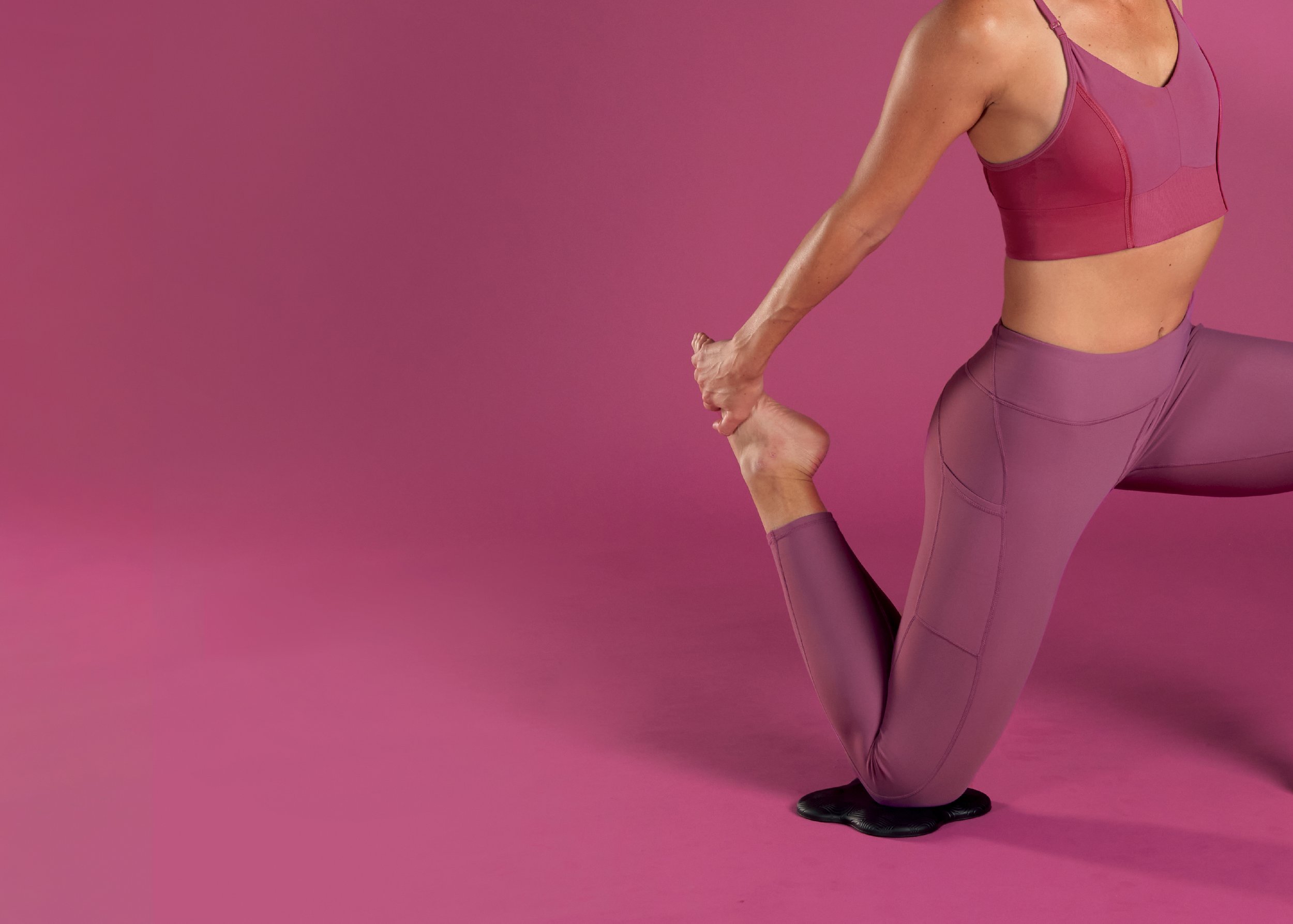
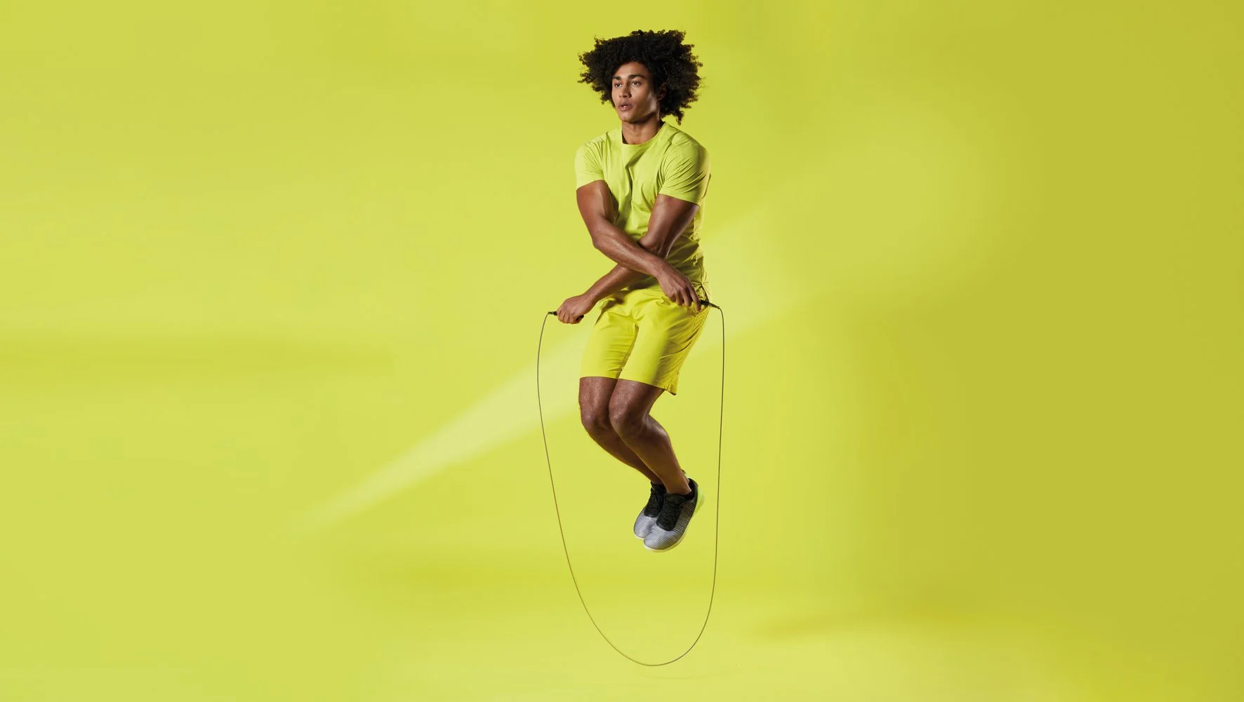
Photography
—
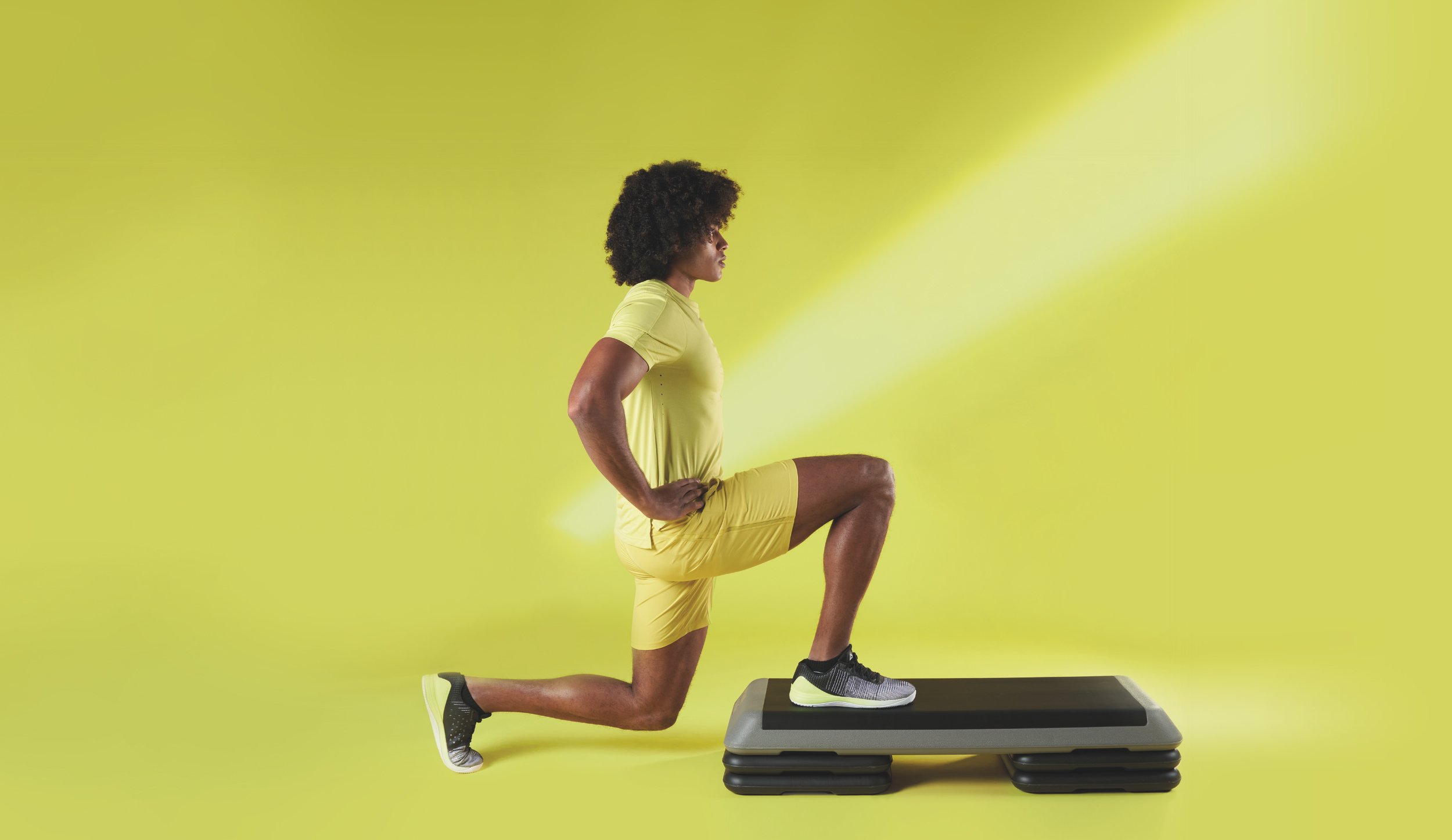
Photography is a key element of the brand refresh. Used predominantly across packaging a framework was created that demonstrated the products in use whilst allowing for sufficient clear space required for use on packs.
The coloured backgrounds and complimentary clothing allowed the darker coloured products to stand out and created a series of bold, contrasting and distinctive images.


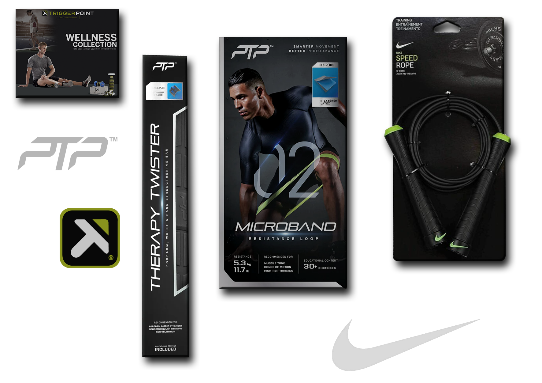
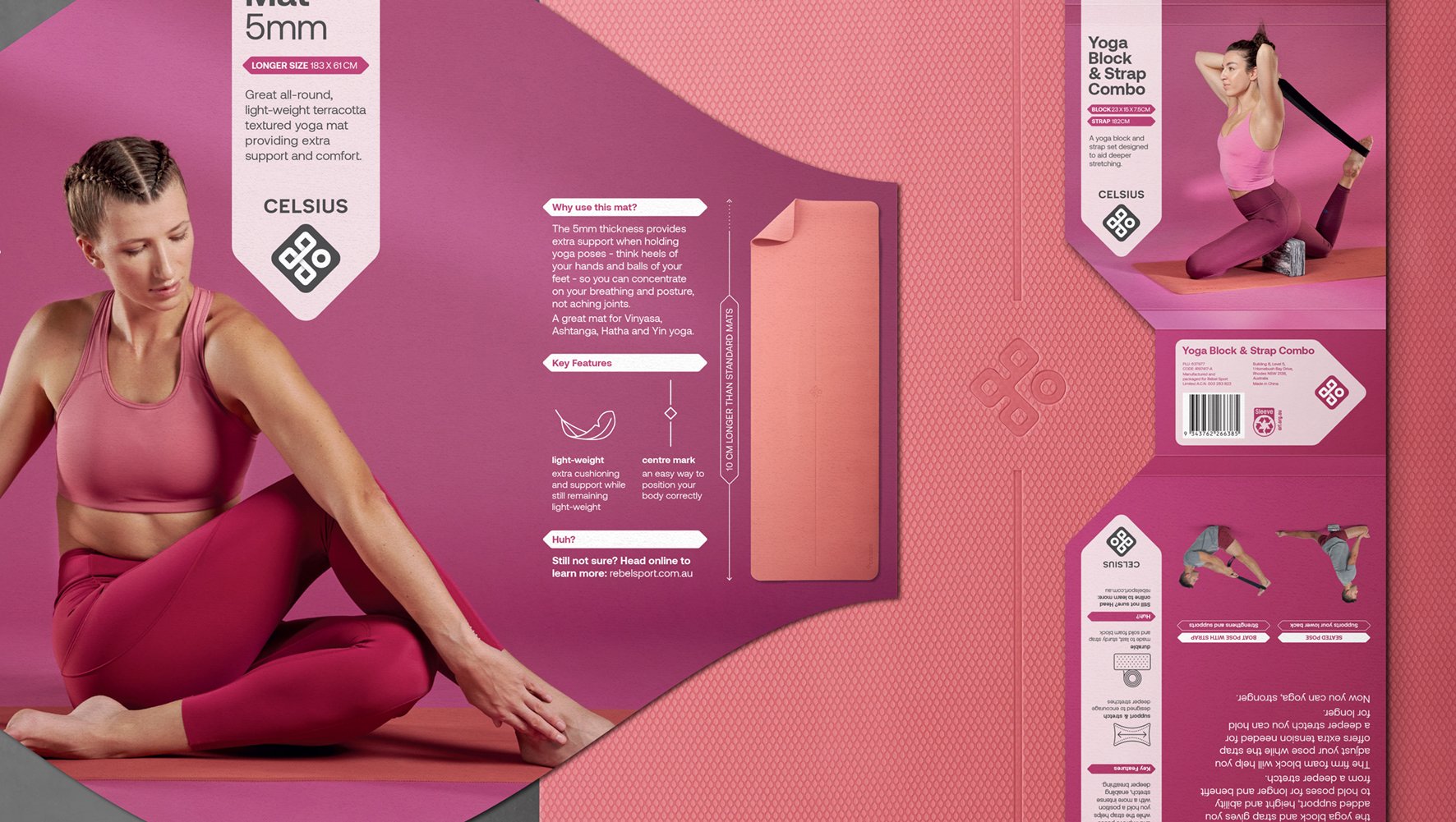
Packaging
—
Flat lays and some 3D packaging, carousle below could show the system being applied one image at a time


Applications
—
To tell their story we created a brand video and book. The book articulated the brand approach whilst the video brought it to life through a dual narrative told by Multigate’s Head of Design Alanna Leighton and Scrub Nurse Beck Liston.


Product Branding
—
As the business grows Multigate have acquired several competitor brands. In these instances we’ve assisted in ensuring the Multigate brand story is translate in a relevant way and where appropriate, a revised identity that is strategically designed to reflect the parent brand.
Brand video encapsulating the joint Eisner and Multigate brand position.

A guideline document outlining the design principles for the brand.

Over a 6 month period the new brand direction was successfully implemented across the business. The benefits of the holistic approach have been acknowledged by customers, employees and the industry, with a recent Good Design gold win for product design.
The creative work was recognised internationally with an Honourable Mention in the US based Graphis Branding competition.
FBD TEAMCreative Director,
Design & Art Direction
— Chris Thomas
Strategy
— Chris Thomas
— Jane Davies
Tone of Voice & Copywriting
— Jane Davies
CREATIVE SUPPORTStructural Packaging
— BlueSky Design
Photography
— Ian Carlson
Artwork & Print Liaison
— Chris Goffin